Untangling information architecture through end-to-end UX research
I researched and redesigned navigation for an extensive product catalog. Finding a specific product meant clicking through a category page, then a product family, and finally... the product.
So, I designed a mega menu with progressive reveal, putting every level in one view and cut the average findability time by ~40%.
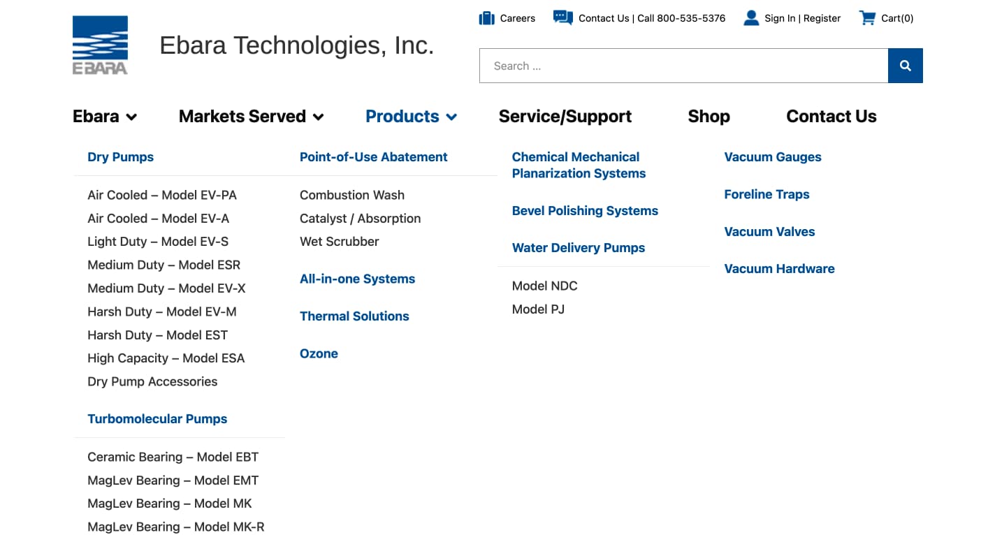
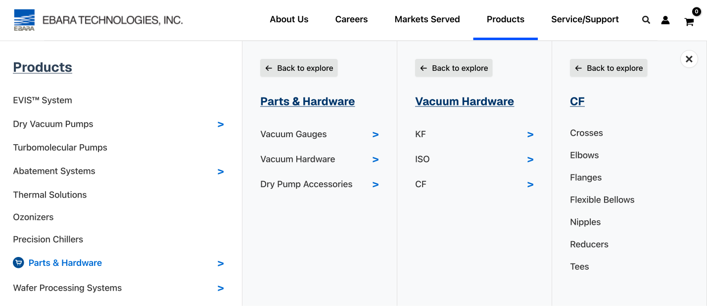
Rethinking Product Navigation for $200K+ Industrial Systems
Most people have never bought anything this expensive online. Even cars, which cost a fraction of this, rarely end with “add to cart.”
So, I wasn’t designing for a checkout. I was trying to understand who was looking, and what they were looking for.
I started with the site analytics to understand navigation paths. Then I interviewed managers to define the target audience. The data and conversations pointed towards two audience(s):
1. An engineer who knows what they need. They want technical specifications, but layers of navigation bog them down.
2. A prospective buyer browsing the site. Unsure where to look, they get confused and leave the site.
Despite their different levels of knowledge, both groups face the same problem: too many steps between them and the product.
Forming Hypotheses
My primary hypothesis was that collapsing the catalog's hierarchy into a single view would help both groups find products more easily. I took a user-centric approach to click rate optimization, aiming to make each click count instead of adding more.
My secondary hypothesis was technical: every click triggered a full page reload, which I could remove on the front end by revealing each level in place.
Measuring Effort over Speed
To validate my hypothesis, I needed usability testing but lacked access to external end-users. I solved this by recruiting internal employees into audience-matched cohorts, using outreach to gauge website and product familiarity.
Respondents on the lower end of the spectrum served as proxies for prospective buyers, while those on the higher end represented engineers. Once cohorts were set, I ran usability testing in two phases:
- Round 1: Tested paper prototypes of my proposed navigation against the legacy structure with a small group, isolating logic from visual design bias.
- Round 2: Conducted A/B testing utilizing a high-fidelity prototype against the live legacy website with a larger group to validate the updated design choices.
Results
- Average time to find a product was cut by ~40%
- Users could bypass intermediate pages entirely, which reduced cognitive load and helped visitors on slower connections
- Including senior managers in usability testing meant they saw the results firsthand, which secured buy-in without a separate presentation.
By giving buyers direct access to the information they needed, it moved them toward a sales conversation on their own terms, serving the business goal without forcing users down a funnel.